Duncan Agnew
This page provides information about the idea making scatterplots more useful by modifying one or two axes to make the distribution more uniform. Often there are so many data in one part of the plot that all we can see is a solid mass, while other parts of the plot are sparsely populated. More information can be gotten from the plot if we warp the scale on one axis (or two) to make the density of points more uniform. This makes the scales nonlinear, but often this does not matter. This methodology is exactly the same as the method of ‘‘histogram equalization’’ used in image processing: often, removing some information, and stretching the available values to cover the full range available, makes the image more informative, at least to our (imperfect) visual system.
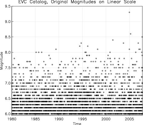
Figure 1 shows a typical plot of earthquake
occurrence, taken from the Engdahl-Villasenor Centennial
Catalog: in this case, global earthquakes of magnitude 6 and
larger from 1980 through 2007. Because of the
Gutenberg-Richter law, there are many more small than large
earthquakes; this, and the common situation that magnitudes
are quantized (in this case to the nearest tenth), means
that the symbols for the smaller earthquakes often overlap,
making it difficult to judge (for example) changes in rates
of occurrence.
To fix this problem, we can do two things.
|
1. |
Map magnitudes into a uniformly-distributed variable. For any randomly-distributed variable, the cumulative distribution is, by definition, uniformly distributed: a common way of generating random variables is to generate uniform psuedorandom numbers and map these through the cumulative distribution. |
|
2. |
If the magnitudes are quantized, we can dither them, by adding uniform random numbers to the mapped values. |
Figure 2 shows how these processes would work for
magnitude 6.5 events, which could take on a number of
different values as they are mapped and dithered.
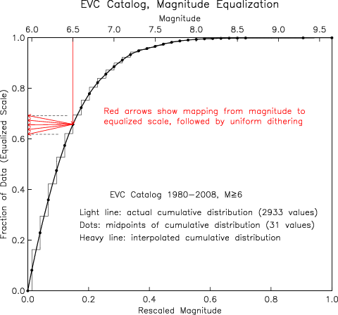
Figure 3 shows the result of applying this
mapping to the data in Figure 1. The magnitude scale is
changed substantially, and the scatterplot becomes
apparently uniform: not very interesting, but easier to
interpret if there are (for example) changes in rate.
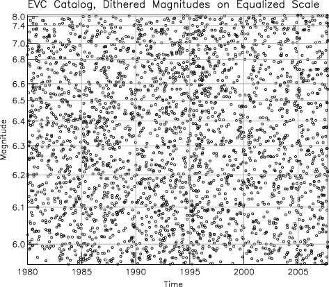
Figure 4 shows this method applied to the catalog
of Southern California earthquakes for 1992, and all events
with magnitudes 2 or more. The magnitude axis is warped to
give a uniform distribution before the Joshua Tree
earthquake on day 114 (the background period), plus the
larger events of the entire year (to make the cdf reach the
higher values). Even though the original magnitudes are
quantized to 0.01 units, the magnitudes have been dithered
by ±0.05 units for reasons explained below. The time
axis is warped to make the distribution across the year
uniform. As a consequence, the time scale is very compressed
before day 114, and then expands during the two aftershock
sequences of the Joshua Tree event on that day, and the
Landers event on day 180. 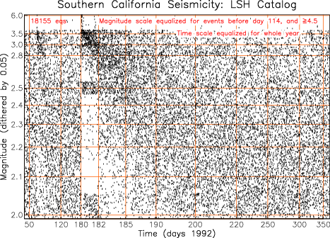
Two things that are evident from this plot that could not otherwise be seen are:
|
* |
Following the Joshua Tree and Landers event the distribution of magnitudes becomes irregular, with greater quantization: after Landers, magnitudes less than 3 become quantized at the half-magnitude level. |
|
* |
There are missing events at lower magnitudes after the Landers event. |
To make it easier for others to create plots of this type, I haver written a software package that will perform the mapping described above. The package (a gzipped tar file) is here; it includes the source code (Fortran 77) and some examples, with the outputs to be expected. This code only does the mapping described above; for making plots, you will need to use whatever system you prefer. My own preference, used for the plots above, is Bob Parker's plotxy package.